
Why and how you should design for mobility, not mobile
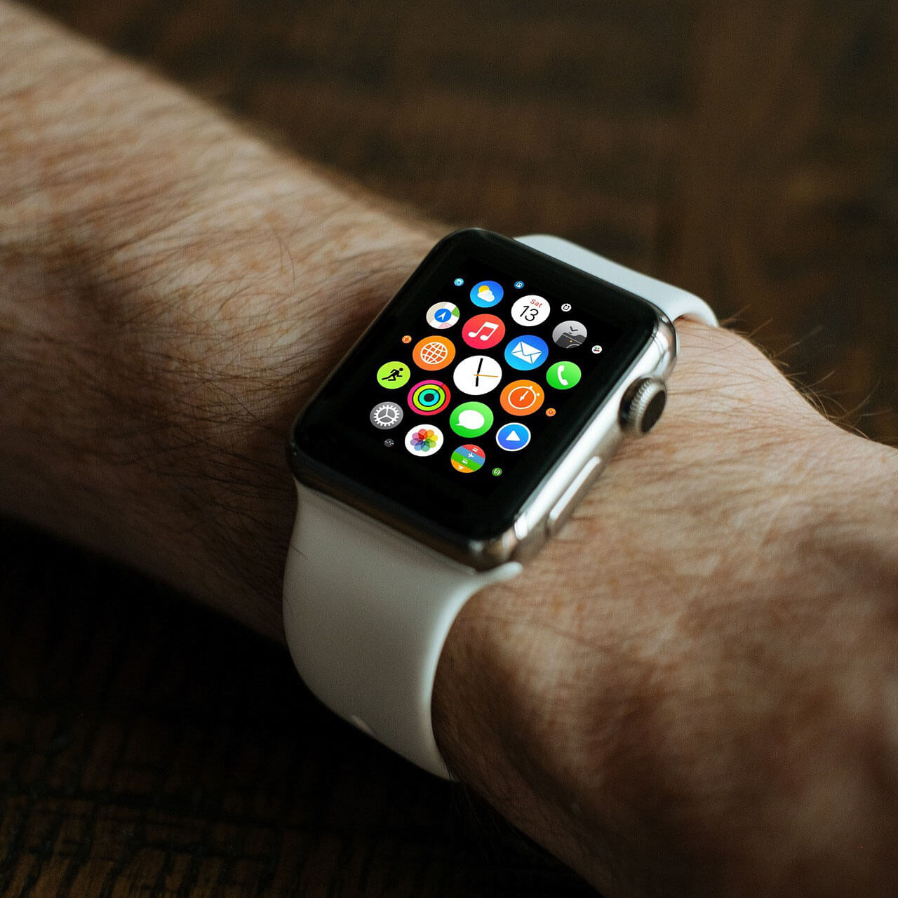
With 85% of adults aged 18-49 often using multiple devices at the same time, it’s a wonder that most marketing executives are still unable to understand their customers’ cross-device behaviours.
Unlike Ascensor, the current method of responsive web design for many web designers is nothing more than being able to adapt to different screen sizes. However, with the ever-changing ‘smart’ device landscape, it is imperative that you start thinking about the “internet of things” when embarking on your next digital project.
Rather than a focus on a specific device, designing for mobility is a broader approach to design. Mobility allows our designers to think broadly and zoom out from specific devices and understand why that device is being used. Here are some ways you can design for mobility:
Harness the power of Context in the user experience
User experience should never be underestimated. If a website or web app fails to be intuitive, you will more than likely lose a customer. Context allows you to better understand how a user may be using that device and enable you to craft a more compelling design.
Though it is impossible to develop the ultimate user experience, there are different tools you can use to help you better understand users and anticipate the effect while designing.
For example, you could use the following Context Circles:
- Physical context: Anticipates the physical setting and activity level of the user.
- Technological context: This covers the design, hardware, operating system, and all other technological factors that influence how the user perceives your application.
- Social context: This is for promotion and the social aspects of the internet that should always be used in a meaningful way.

Make your design truly “responsive”
Designing for mobility means that you need to bring back the concept of “responsive” to its fullest meaning: being able to respond. Most designers are currently underusing what we already know about the user’s context.
A truly responsive design allows the UI to adapt to the external environment. This could be anything from changing the colour scheme from light to dark based on the sunset time, to giving recommendations based on the GPS location. Embracing true mobility means thinking harder about serving the user better, not just adapting to different screen sizes.
How Ascensor can help
Ascensor web design projects start and finish with User Experience (UX Design), it is at the heart of the design and development process. Our process is completely focussed on the user, to ensure we optimise each website or app to be easy to understand, navigate and interact with, whatever the device. If you are looking to give your next design mobility, let’s have a chat.