You probably already know that your website has an effect on the perceived credibility of your business. But very few people actually understand the scale of this effect. As it happens, many businesses struggle to transform poorly-performing websites into websites that boost credibility and client acquisition.
1. It Takes Around 50 Milliseconds for Users to Form their Opinion About your Website
Your website, like everyone else’s, is subject to extreme levels of snap judgements that influence a user’s perception of quality and credibility. The reason is that there are multiple search results that fit the user’s needs (providing the search query isn’t extremely obscure) and websites are scrutinised swiftly and ruthlessly.
It’s probably easy to guess which website you’re going trust the quality of.
There’s only one way to get rid of snap judgments of your website that could be costing you customers; improve the design. While this may seem like it could be a massive undertaking, those 0.05 seconds could be fatal. Can you afford to lose them?
2. A Study Found that 94% of Negative Feedback on a Website was Design Related
Since users are making judgements about the quality of your website in less than a second, the most logical way of impacting this decision is with design. There are a few simple ways to make sure that your website doesn’t look like it was built in 2002; make sure your images look like they were taken this decade and your fonts are modern. There’s nothing quite as off-putting as the Comic Sans font on a website.
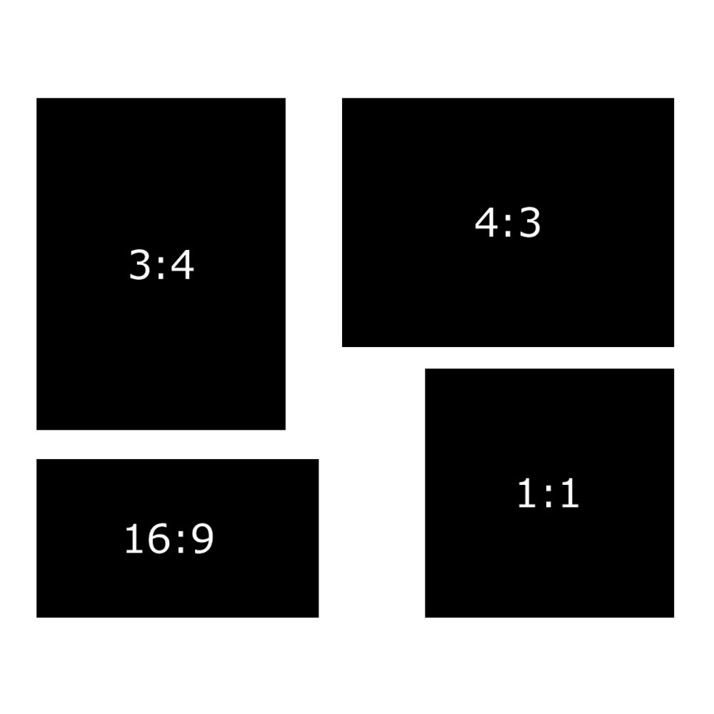
Another factor that is important in website modernity is the aspect ratio, or the width to the height of the screen. If your site has a 3:4 aspect ratio, then it’s a sign to the user that it’s outdated and probably should be regarded with any sincerity.
It’s recommended that you opt for a more modern 16:9 or 4:3 aspect ratio to cater to more modern widescreen devices.
3. 85% of Adults Think That a Company's Website Should be as Good or Better on a Mobile Device as it is on Desktop
Having a website that users need to zoom in on their mobile device might as well be a message for that user to look elsewhere and they should be able to work that out in 0.05 seconds.
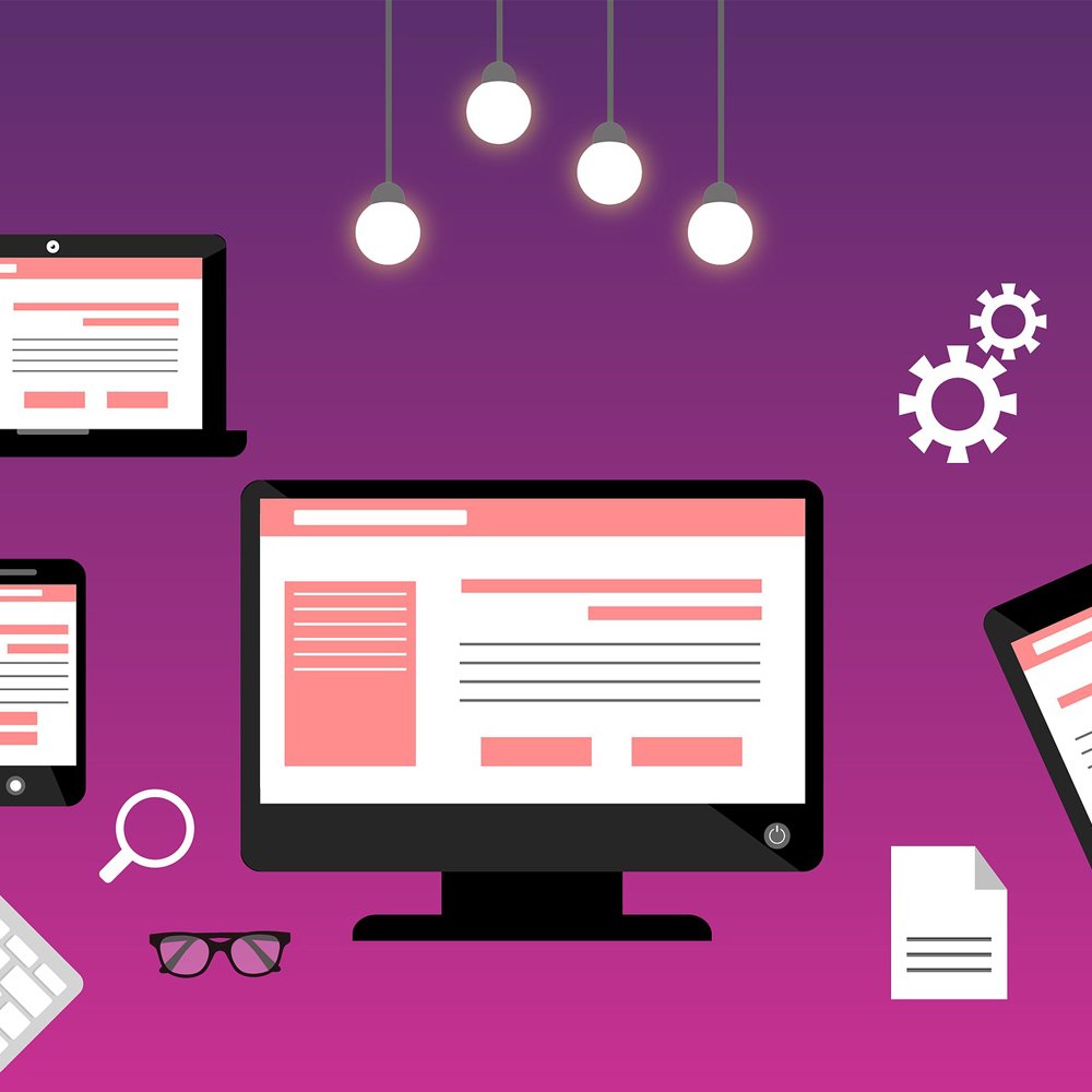
Nowadays, all websites should be responsive. In other words, the display of the website should adjust based on the width of the device with which it is being viewed. If your website is responsive, aspect ratio becomes less important – this is because the priority becomes filling the screen on all devices in such a way that its’s legible and easy to navigate.
4. 88% of Consumers Online are Less Likely to Return to a Website if they had a Bad Experience
The internet isn’t in the habit of giving second chances. In fact, if everything we’ve learned so far tells us anything, it’s that bad website design, outdated aesthetics and poor usability can kill your credibility. Therefore, it’s important to get to the root of the problem.
If your website is 5 years old and hasn’t been updated in that time, then the answer is simple: implement some of the design tips above and create a modern, responsive website. But what if you’ve already improved your website and users are still bouncing from your website? There are a few User Experience tips that can help you:
- Use Hotjar to produce heatmaps and scroll tracking
- Use video to optimise your sales landing page
- Pay close attention to your CTA (call-to-action) button placement
- Choose CTA colours and designs that are tried and tested to convert
- Create CTA headlines that create urgency and scarcity
- Set up goals in Google Analytics
- Check your website speed and optimise your images
- Ensure your website has high readability
- Create better, easier to use web forms
- Use A/B testing to find out which CTAs, images, contact forms etc. better resonate with your users
A better user experience equals higher conversion rates, which equals to a more successful business.

5. 77% of Agencies Believe that a Bad User Experience is a Weakness for Clients
This
statistic makes bad UX the most significant weakness the agencies identified.
It’s almost as though there’s a pattern going on: User experience and web
design are not separate concepts – they are connected.

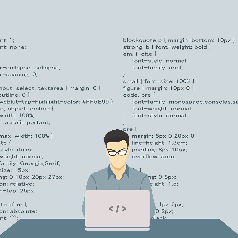
6. 39% of Users Stop Engaging with a Website if Images Don't Load or Take too Long to Load
If a company is failing to update and fix broken images throughout their website, it doesn’t speak highly about their level of organisation and attention to detail. Similarly, images have the ability to significantly slow down the load times of web pages, leading to even more causes of users going elsewhere.
7. 47% of Users Expect a Maximum Loading Time of 2 Seconds for an Average Website
Fortunately, the culprit for slow loading times of images
is simple enough to identify: the file size is too large. So, while it may be
very tempting to fill your website with beautiful, aesthetically pleasing
images, it can detract from your website’s effectiveness in a big way.
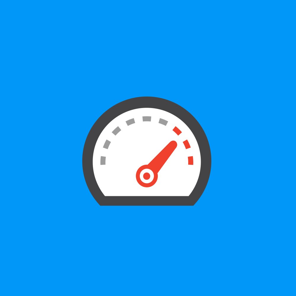
In fact, not only do slow loading times effect user behaviour by causing your users to leave your website, it can also have a damning effect on your SEO. You can test your page speed with this handy, free tool we’ve made so you can diagnose any potential loading issues.
8. Slow-Loading Websites Cost Retailers £1.73 Billion in Lost Sales Every Year
If your website is slow, you’re going to be missing out on the opportunity to bring on new customers to your website.
Slow loading times are incredibly frustrating for online shoppers, but search engines don’t take this lightly either. Google considers a page to be ‘slow’ if it takes longer than 1.5 seconds to load and will consequently relegate it in search rankings.

9. 75% of Consumers Admit they've Made Judgments on a Company's Credibility Based on their Website Design
If you stop to think about that, it’s actually quite an
incredible thought that the credibility of a company is so intrinsically linked
to the aesthetic quality of their website. But in 2018, a website serves as a
valuable insight into how a company operates. Therefore, it needs to project
credibility in every sense. However, credibility is also driven through a sites
content and this should always go hand in hand with design.
A sites content can be anything from blocks of text, images,
videos or even large headlines. How your content is integrated with your site’s
design is equally important as what they say. Good design relies on seamless integration
of quality content into the overall scope of your website.
Your websites content, in whatever form it takes, should
reinforce the design. This way, the high-quality aesthetic value of your
website is bolstered with evidence of success that keeps users interested and
engaged.

10. It Takes a User 2.26 Seconds for Their Eye to Land on the Area that Most Influences Their First Impression
As shown the first statistic, it takes less than a second for a user to form their opinion on a website’s quality. And we’ve also discussed the fact that if your website passes the user’s snap judgement test, it needs to keep retaining the user’s positive impression.
It doesn’t stop there. Your website needs to capture the
user’s first conscious impression, which is typically an area on your landing
page that will influence their perception of the quality of your website. Users
take an average of 2.6 seconds to find this area, so it needs to be engaging
immediately.
The key here is a combination of clarity and design. Every
landing page should have an area where you want your user’s eyes to land. More
often than not, this will be a line of text or some media that introduces your business
to the user.
If you want users to gravitate towards something specific,
try pushing that element towards the top left of the page and maintain that
structure throughout your website. Eye-tracking studies by Nielsen
Norman Group have found that users mimic the way that they would read a
book when scanning a website, starting from the upper part of the content area,
reading horizontally from left to right.
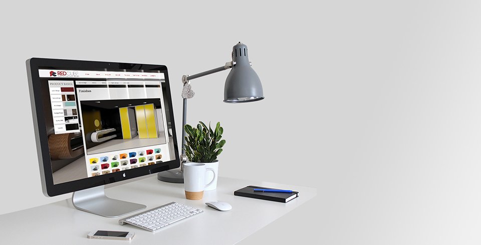
11. Users Spend 5.94 Seconds on Average Looking at a Website's Main Image
Images add significance to the user’s impression of your
website, while also adding some creative flair. This shows us that users do pay
attention the main image on a web page, making it important to ensure that this
image communicates effectively to reinforce your brand.
Choose images that have relevance to your sector and won’t
distract from the overall goal of your site. But most importantly, remember not
to go overboard.
An image slider may seem like a great idea because it allows
you to portray your company in more than one setting or pitch various offers –
but most statistics show that sliders have a detrimental impact on conversions and
user opinion.
Sliders have a tendency to distract the user from what they original
intended purpose was when they originally came to your website. Coupled with
the fact that users only spend 5.94 seconds on the homepage image means that
the first image in the slider is usually the only one they see.
12. Users Spend 5.59 Seconds on Average Looking at a Websites Written Content
5.59 seconds doesn’t seem like a lot by any standards – so you
may be asking how it is possible to get the right message across for your
company in such a short space of time?
A process called Progressive Disclosure. This helps to
maintain the focus of the user’s attention by reducing clutter and cognitive
workload and presents the minimum data required for the task at hand. As long
as it is easy for users to find what they need, this can be a great way to
create a better user experience.
Bearing in mind that users spend an average of 5.59 seconds
consuming written content per page, this content needs to be as effective as possible
to portray your company in a positive way and get your users where they need to
go.

13. 70% of Small Businesses Website's Lack a CTA on their Homepage
As difficult to believe as it sounds – users want to know
what your site wants them to do, however, they may not always actually carry
out the desired action. Your website is a great tool for boosting your credibility
and serves to inform users of your products or services – but most importantly,
it’s your online point of sale.
If your car breaks down and you urgently search Google for “breakdown
recovery near me”, you need help immediately. If a website lacks a clear way for
you to get in contact straight away once you’ve briefly vetted the company,
then what is the point?
A breakdown recovery service is an example of a commonly
used service requiring immediate action, but even a company with a longer sales
cycle can benefit greatly from having some sort of CTA on their homepage.
This tells users what you have to offer while making it as
simple as possible to purchase your products or request your services. The type
of CTA you put on your homepage will differ depending on the kind of business
you run, but if your homepage is lacking one, users will choose other
companies.
14. In a 15 Minute Window, Two-Thirds of Users will Choose to Read Something Beautifully Designed than Something Plain
Nobody enjoys large blocks of text, one after another. It’s
monotonous. Depending on what search query leads a user to your website, the
homepage might not be the page they arrive at. They may land on a page that is
much more content-heavy that satisfies their search intent.
With that said, each page should be designed and built to increase
user engagement – not just your core marketing pages. If a user lands on a page
of content that looks like a university essay, you’re probably more likely to
leave it in favour of content that offers more excitement and is easier to
consume.
Your content should be created with the user in mind,
regardless of whether it is your services page or a blog post. Even on your
core marketing pages, you should be using enough detail that educates the user,
but don’t go overboard to confuse/bore them. Try to also include images, videos
or graphics to reinforce the content and keep the user engaged.
15. First Impressions are 94% Design Related
In this study, these participants noted that websites were often
difficult to navigate, cluttered and complex. The study also cited participants
you commended on bad use of colours, excessive pop ups and advertisements, boring
design, inadequate intro content and ineffective search features.
46% of consumers in the same study based their decisions on the credibility of websites on their visual and aesthetic appeal. This includes layout, typography, font size and colour schemes.
What This all Means
Your website will be a magnet for judgement and this is not limited to the website itself, it carries over to how users perceive your company. A bad website has the ability to tarnish the credibility of your company – but a good quality website has the ability to be your 24/7 sales tool.
Ascensor knows how important first impressions are, and we
know how to make them count. Get in touch today and lets discuss how we can turn
your website into a conversion magnet!