With over 1.2 billion mobile web users worldwide can your business really afford not to have a mobile friendly website?
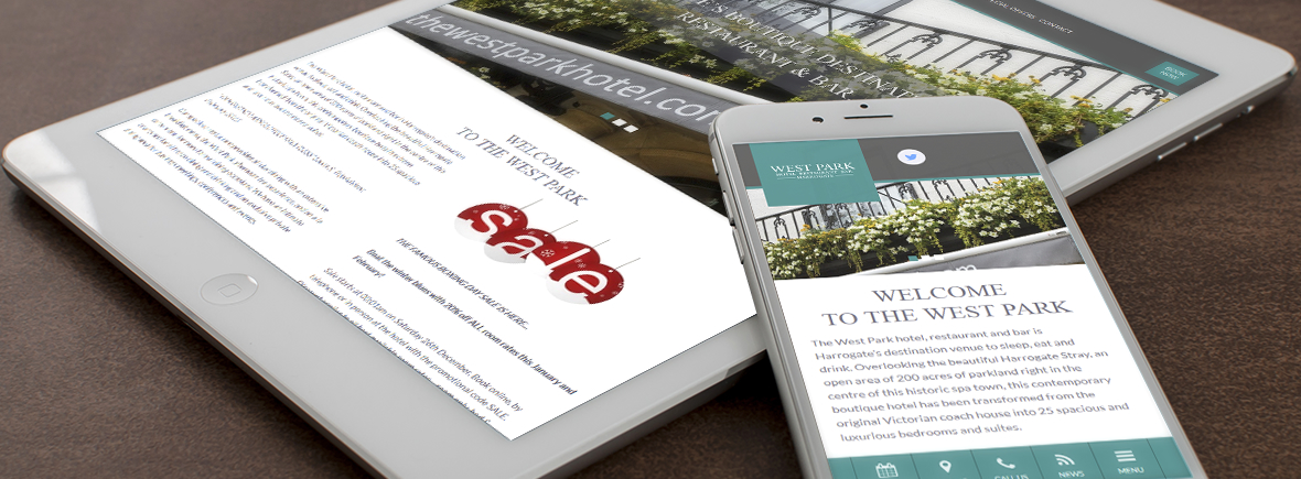
Firstly what is responsive design? It is an approach to web design that aims to create a website with optimal viewing and interactive experience on a wide range of devices. Think of your content as water, if you pour water into any container it changes to fit (a teapot, a glass, a bowl. . .), if your site is fully responsive that’s what your content will do, change to fit desktop, tablet or mobile. A responsive website will do this by utilising multiple fluid grid layouts.
Key Features to Consider when building a responsive website:
- User objectives first – what do your clients want to achieve from their website? What will the user’s journey be through the site? Look at your client’s business plan and make sure you are aware of how the website will be used. This will tell you what to prioritise when making a site responsive.
- Declutter mobile interface- there may be multiple elements visible on the desktop site that you cannot have visible on a mobile site. For example these could be movable sliders or multiple tweets, but remember to keep key components and interesting graphics on the page.
- Call to Action Placement – make sure to keep your key CTA’s in a logical placement, for example menus at the bottom instead of the top so they’re closer to the users thumb.
- Prioritising key content- If a desktop website design has a bold title or an important picture on the landing page, try to keep it in a similar position on the mobile site. This way the company’s message is not lost or changed. Think about how you can move around or edit existing content to make it more mobile friendly rather than cutting it out.
- KISS – “keep it simple stupid”, don’t overcomplicate your site, if you’re trying to make the mobile site do too much it is more likely to crash or it will be too complex for users.
- Tap Targets – are they in appropriate place and a reasonable size? There’s no point putting a tap target in a prime spot if it’s too small for anyone to use, but make it too big and it will dominate the site and distract from other content.
Future Proofing your Site:
- Mobile first code – Coding the mobile part of your responsive site can help future proof in a number of ways: the site performance will be increased, the site will be more usable, faster and rank better.
- Use of SVG images – due to the trend of high density pixel displays emerging (for example Apple retina display screens) ensuring your images and graphics are of high quality is pivotal. SGV’s are the perfect solution when working with icons or graphics that need to be scalable and responsive.
- Hardware accelerated CSS – CSS animations add “eye candy” to a website, and basic CSS animations work on a mobile device, however animations aren’t as “smooth” and they can be slow or jumpy to load. Adding hardware accelerated CSS allows more of the mobile devices capabilities to be used, allowing the site to perform better making for a superior overall user experience.
To learn more about responsive design visit our web page or contact us today!